reMarkable Paper Pro Review
After weeks of waiting, the Remarkable Paper Pro is finally here!
In the video below, I dive deep into the features, upgrades, and overall experience of using this third-generation digital note-taking device.
If you’re curious about how it compares to the Remarkable 2, or if you’re considering switching to the Paper Pro for digital planning, you’re in the right place.
Key Highlights:
- Backlit display and color feature
- Keyboard folio design
- Performance improvements
- How the Remarkable Paper Pro enhances digital planning
- Distraction-free environment for better focus
If you’re a fan of digital planners or want to see how the Remarkable Paper Pro can streamline your workflow, make sure to watch till the end.
And don’t forget to check out our comparison of the Remarkable 2 vs Paper Pro to help you decide which is the best fit for you!
Visit the reMarkable Paper Pro Planner Shop
Visit the reMarkable 1 & 2 Planner Shop
reMarkable Paper Pro Overview
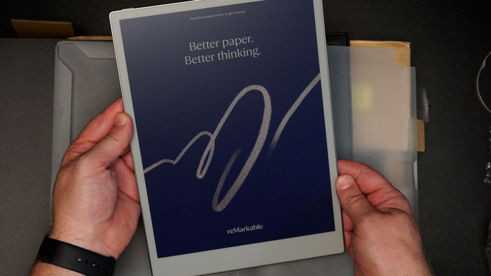
After weeks of anticipation, the Remarkable Paper Pro has finally arrived. Since the launch, I’ve been eager to explore its new features, especially after creating a video a few months ago predicting what the Remarkable 3 might look like. If you’re interested in that video, you can check it out [here]. It’s been exciting to see how much this device has evolved, but there are a few aspects that left me both intrigued and slightly disappointed.
What’s New with the Remarkable Paper Pro?
The Remarkable Paper Pro—also referred to as the Third Generation Remarkable—comes with several significant updates. There’s been a lot of conversation around what users wanted to see in the Remarkable 3, and many of these features have been incorporated into this new release. For a full discussion, take a look at the comments on our earlier video. Now, as I unbox the device and dive into its functionality, here’s what stands out.
- Form Factor: The design of the Remarkable Paper Pro feels modern and sleek. The larger display and subtle edging add a professional touch.
- Keyboard Folio: One of the more impressive aspects is the keyboard folio. It’s brilliantly designed, offering seamless functionality for writing and navigation.
- Backlit Display and Color: The introduction of a backlit screen and the addition of color are two of the most requested features. These changes alone elevate the device and make it more versatile for various use cases.
Performance Upgrades and New Accessories
Along with these major design updates, the Remarkable Paper Pro includes a new screen, an improved writing pencil, and significantly faster performance. Whether you’re navigating through your planner, browsing PDFs, or typing with the keyboard, you’ll notice a major improvement in speed and ease of use.
Having used the device for a few days, I’ve been impressed with several aspects of the Remarkable Paper Pro. However, if you’re weighing your options, this may not necessarily be the perfect device for everyone. If you’re considering your options, check out my video comparing the Remarkable Paper Pro to the Remarkable 2, so you can decide which one fits your needs.
Perfect for Digital Planning
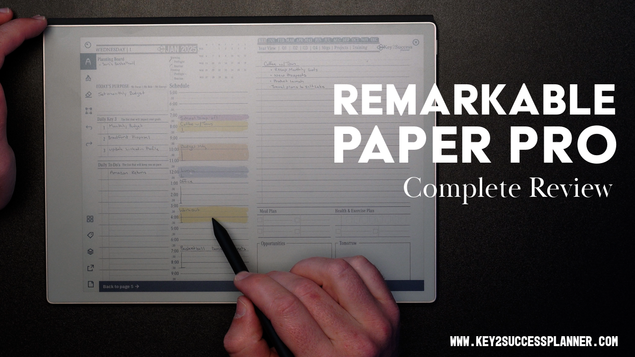
As someone who uses digital planners extensively, this device offers a lot of potential. The backlit display and the ability to use color allow for enhanced time blocking and improved visualization of tasks. With color-coded graphs, notations, and the ability to plan without distractions, the Remarkable Paper Pro adds clarity to my workflow, making it easier to stay on top of my goals.
Distraction-Free Environment
One of the main benefits of the Remarkable series is its ability to create a distraction-free digital environment. When you’re using it for digital planning, this focus becomes even more important. By limiting the distractions that often come with tablets or smartphones, the Remarkable Paper Pro helps you organize your ideas and turn them into actionable plans.
The Future of Digital Paper Devices
While I’m excited about the updates, not all of the features I was hoping for made it into this release. Still, the Remarkable Paper Pro makes meaningful strides forward. As competition in the digital note-taking space heats up, with brands like Onyx Boox leading the way, I think we’ll see even more innovation in the coming years.
One feature I’d still like to see is the ability to download and integrate apps, like Kindle, directly onto the Remarkable Paper Pro. While you can upload books, having the Kindle app built-in would be a game-changer. That said, the lack of app integration is likely intentional to keep the Remarkable series focused on reducing distractions.
Final Thoughts on the Remarkable Paper Pro
If you’re looking for a powerful, distraction-free tool for digital planning, the Remarkable Paper Pro is definitely worth considering. With its backlit screen, faster processing, and color capabilities, it has a lot to offer.
Curious about whether this is the right digital planner for you? Check out my comparison video where I break down the differences between the Remarkable 2 and the Remarkable Paper Pro, and help you decide which one is the best fit.
And for more digital planning tips and product reviews, make sure to follow me, Branden Bodendorfer, creator of the Key2Success Planner. Keep an eye out for our next video!
Visit the reMarkable Paper Pro Planner Shop
Visit the reMarkable 1 & 2 Planner Shop


