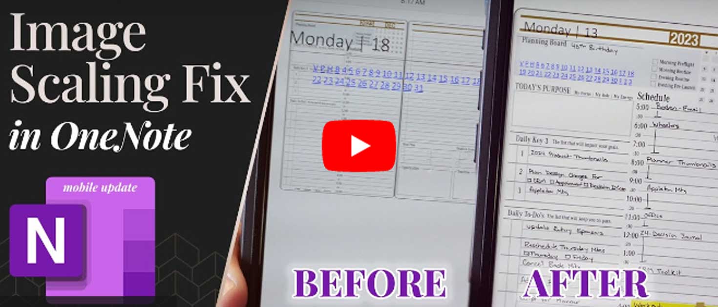
Great news for OneNote users! Microsoft has issued a bug fix for the image scaling issue on iPhone. That’s right, your feedback helped and the OneNote scaling issue on iPhone is fixed (mostly). Update: Microsoft had to create a new workflow to support the Ink and Image Capture feature.
Today marked a milestone as I celebrated my 40th birthday, but the real surprise wasn’t just in the number—it was an unexpected present from Microsoft. On my special day, Microsoft released a crucial update to the mobile version of OneNote, and little did I know that this could be the greatest gift ever.
A Digital Planner’s Disappointment
For those deeply entrenched in the digital planning world, recent months brought a wave of disappointment. An update in April and subsequent ones in May and June wreaked havoc for Android users. A nagging background image scaling issue surfaced, causing distress among users relying on OneNote for digital planning. If you’ve purchased a OneNote planner during this time, you may have experienced the frustration firsthand. The background images on mobile devices inexplicably shrank, creating chaos that echoed across the entire ecosystem.
Imagine meticulously planning your days, weeks, or even months, only to find that your mobile device displays a miniature version of what you intended. The frustration was palpable, especially for users like me who depend on the synchronization of planners across various devices.
However, today was different. As I eagerly explored the update, I discovered that the mobile version of OneNote had undergone some much-needed changes. The background scaling issue persisted, but a closer look revealed a glimmer of hope when navigating to specific dates within the planner.
A Partial Fix
It was a partial fix, but a fix nonetheless. The familiar background scaling issue remained when opening the mobile version, but when diving into specific dates, everything appeared as expected. It was a moment of relief, a step forward in the right direction.
To help you make the most of these improvements, I’ve put together a simple walkthrough. Synchronizing your page section before delving into individual pages is key. It’s a workaround for potential hiccups and a method to regain control of your mobile planning experience.
A Step-by-Step Guide
Open Your Planner Page: Start by opening your planner page on your desktop.
Make Annotations: Add your notes, make changes, and observe the real-time updates on your desktop.
Synchronize the Page Section: Before jumping into individual pages, synchronize the page section. This crucial step ensures that your changes are accurately reflected on your mobile device.
Navigate on Mobile: Head to your mobile device, pull down to refresh, and navigate to the desired date. Voila! Your planner now appears as expected.
The Cloud Quirk
Be mindful of potential quirks in the synchronization process. If you encounter issues like the previous page loading instead of your recent changes, fear not. A quick trip to the desktop version, where you can restore previous versions, and a subsequent synchronization can resolve the discrepancies.
While this update may not be the perfect resolution, it signifies progress. Microsoft is likely working on a more comprehensive improvement, aligning with the diverse needs of users across various devices and features.
As users, it’s essential to continue expressing concerns and feedback. Your input plays a vital role in shaping the future of OneNote updates. For Android users, this should bring a sense of relief, and Apple users can anticipate improvements down the line. (Submit feedback to Microsoft HERE)
OneNote’s Evolving Landscape
In closing, let’s look beyond the current challenges. OneNote’s future promises exciting features, including the ‘Year at a Glance’ view and digital tiles. These additions will undoubtedly elevate the OneNote experience, making it even more versatile and user-friendly.
As users, let’s embrace these changes. Explore the new features, share notes seamlessly across platforms, and make the most of the improvements. The road to an even better, more efficient note-taking experience with OneNote is paved with optimism.
Today’s unexpected gift from Microsoft brought not only an update but a renewed sense of hope for the OneNote community. As we move forward, adapting to changes and expressing our needs, let’s look forward to a more seamless and enjoyable digital planning experience.
If all Fails, Then What?
If everything fails, you may want to consider switching to different applications. One application that has been very successful is Nebo. Nebo works on Windows, Android, and Apple devices. However, it is a completely different app and uses our PDF planner.
Key2Success Planners
Choose the Application that you plan to use for digital planning.
OneNote

Application works across Windows, Android and Apple. Also Web version all available. Great for Desktop, Laptop and Mobile users.
GoodNotes

Application works across Apple devices. Great for iPad, Mac and iPhone users. PDF Annotation App designed for Note-Taking
Noteshelf

Application works across Apple devices. Great for iPad, Mac and iPhone users. PDF Annotation App designed for Note-Taking
Notability

Application works across Apple devices. Great for iPad, Mac and iPhone users. PDF Annotation App designed for Note-Taking
Samsung Notes

Application works across Samsung devices. Great for Samsung Tab and Samsung Galaxy Users. Including Z Fold 3, S6, S7, S8 and S22.
reMarkable

Works with ePaper Devices, like the reMarkable, SuperNote and many more. A PDF Annotation Planner allows users to take digital notes.


